“Having completed a brand identity exercise, we appointed Silverback to turn these words into reality. We were really impressed with the range of concepts we were presented with and have enjoyed the process of watching the website and stationery develop during the process to launch. We are really happy with the finished product and feedback from our clients and contacts has been fantastic.” #Troopwork
Matthew Oliver
Partner, Bessler Hendrie Chartered Accountants


Discover
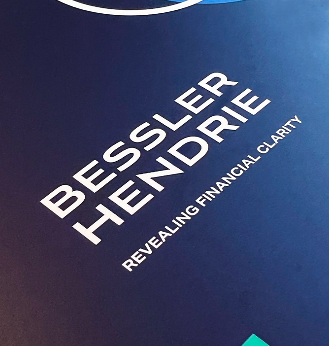
Bessler Hendrie are chartered accountants, offering big firm thinking with a small firm ethos; helping clients achieve their financial ambitions. They came to us after quite an intensive internal audit where they established their brand strategy to lead the direction for a rebrand. Having the strategy in place meant they were well-informed to give us a detailed brief on their hopes for a visual identity and requirements for a new website.
We went above and beyond to really understand the brand – its purpose, goals, mission and values. Part of the project was to investigate a range of ways we could raise awareness of Bessler Hendrie, making sure we stayed true to their values, whilst clearly communicating their ethos to their ideal target market.

Design
We devised a way to display the four key commitments the company make to each customer, that make up ‘The BH Way’ in a clear and easy to understand format, separating them from their competitors, who are prone to overloading the client with jargon. ‘The BH Way’ is, Big Firm & Small Firm Thinking, Collaborative & Approachable, Clarity & Simplicity and Strategic & Adventurous. Ultimately, Bessler Hendrie came to us for a full rebrand, so the initial priority was to design and develop a look & feel that was relevant to the brand and its goals.
The coloured shapes represent different companies/clients, while the white or dark blue shapes represent Bessler Hendrie and how they get to know their clients. The Bessler Hendrie shape is always on top of the coloured shape to illustrate their focus on an area of the client’s business, whilst always keeping the bigger picture in mind. The shapes also adapt to internal use to support the 4 parts of ‘The BH Way’.
We decided to create a simple yet distinctive design, using colours strongly associated with the business sector as the base – white and blue. We created some contrast with the ‘pop’ of colour from the extended colour palette, which we integrated into the design via the core shapes of the brand.

Develop
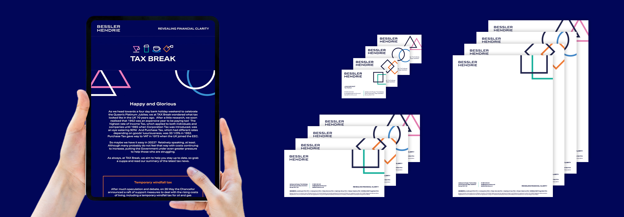
Over the course of the development stage, we asked ourselves, “what could we do to help them expand?”. While keeping in mind budgets and timelines, we decided on a set of launch materials which included a double gate fold marketing leaflet, stationery (including email signatures), HTML email templates and signage.
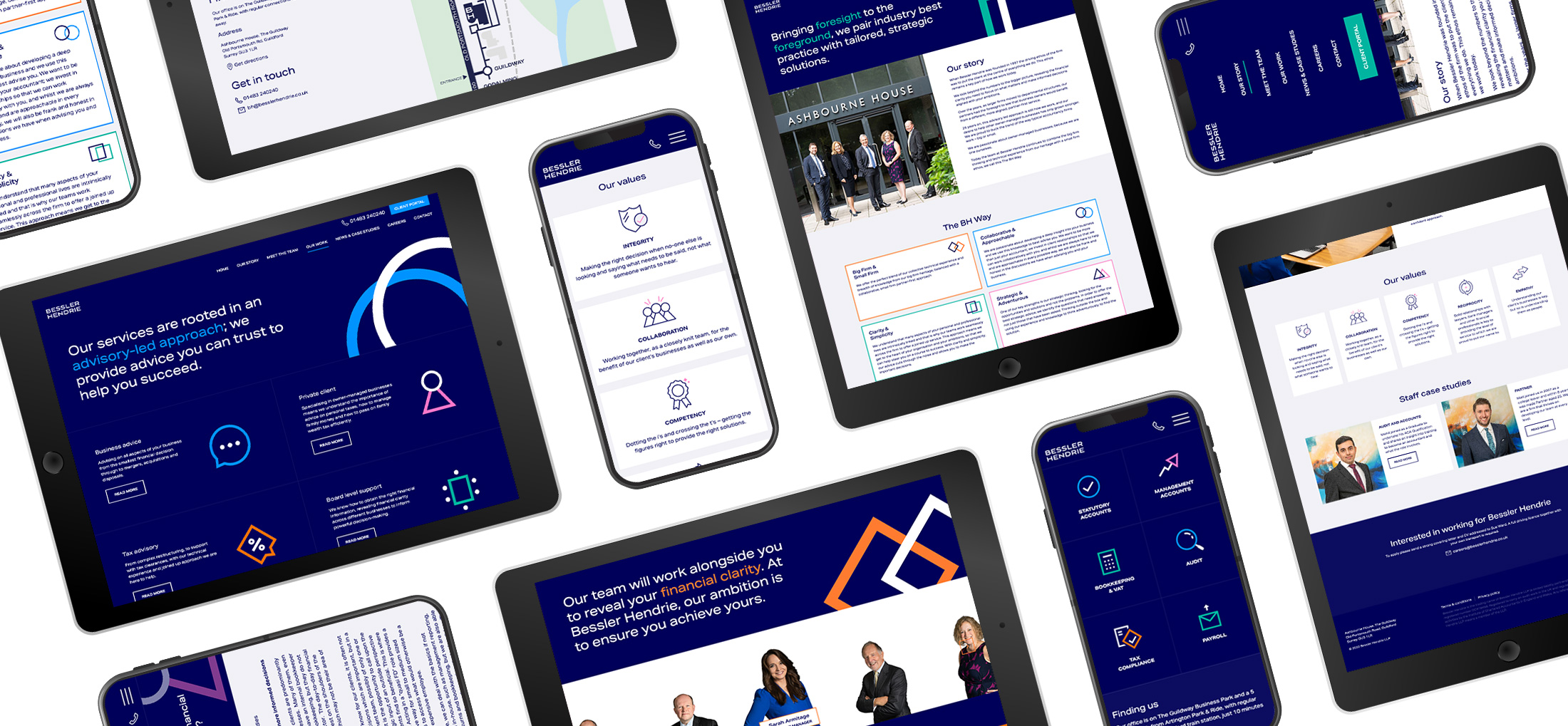
Future-proofing the brand as well as possible was key, making sure any changes to the brand strategy that might have an impact on the identity would be simple and easy to implement. The website follows the same bold branding, with minimal photography and reserved use of the extended palette, creating a very business-forward but approachable interface.


Deliver
Overall, this project showcased how we excel in creating a wide range of deliverables – both digital and traditional. We especially enjoyed working with the team at Bessler Hendrie; their clear vision and confidence in their brand and its values partnered with our branding expertise resulted in a clean and effective brand identity which we are both incredibly proud of.
If you’re looking for help creating an eye-catching professional visual identity for your brand, get in touch and see how we could help! 👇👇
Let’s have a chat…
"*" indicates required fields


