

Share:
It’s not often that we get the opportunity to work with a brand that has been around for nearly 750 years. In fact, this was a first for Silverback®. Incorporated by Royal Charter in 1272, the original purpose of The Fishmongers’ Company was to oversee the selling of fish in the City of London to ensure ‘none but sound fish be offered’. Quality control and the maintenance of high standards of trade skills among fishmongers in the City were central to this purpose.
As the catching, processing and trading of fish has changed over the centuries, so has the Fishmongers’ connection with fish and fishing evolved. Today, whilst only a few of their members are closely involved in the fishing industry, the Company continually seeks to find ways to have a useful and relevant role in today’s society, building on its heritage and traditions.
The Fishmongers’ Company has a broad remit, and they engage with many different audiences in lots of different contexts; from their members and trustees, to fish and fisheries related organisations, to the many rehabilitation charities that they support through their Philanthropy and Grants projects.

The Challenge
Silverback® pitched for the redesign of The Fishmongers’ Company website which the organisation knew was no longer fit for purpose. We were successful and suggested a brand refresh as part of our recommendation to create some clarity in terms of the company and charitable causes. They knew that the way they were presenting the brand was inconsistent and underselling the great and varied work that they actually do. They also realised that brand consistency was crucial to being recognised and valued; that this will ultimately lead to the success of their Company.
Share:
“A rebrand of an organisation steeped in so much history obviously has to be very carefully considered. Anything we did needed to live up to their Vision, to be ‘a modern company with traditional values’.”
Lucy Percy
Brand Strategy, Silverback®
Our Approach
Using the Company strategy piece that they had already developed themselves, we ran a workshop with key stakeholders within the organisation and the different parts of the business, to really understand the hopes, desires and challenges they each faced. We quickly learnt that everything we designed would need to be approved by the ‘Court’; at first we thought this could be challenging but luckily they were open minded and seemed to embrace change!
The Full Achievement
The Full Achievement is a display of all the heraldic components, including the coat of arms. For over 500 years The Fishmongers’ Company has proudly displayed its coat of arms, but the design is an amalgam of two much older arms relating to competing parts of the fish trade.
Originally, the fish trade was separated into two branches and represented by two distinct companies; the Saltfishmongers (who preserved their catch using salts) and the Stockfishmongers (who let their catch dry naturally in the air). After centuries of tempestuous relations, the two Companies were formally merged in 1512, and the current arms was granted to reflect this unification. In the blue section of the arms, the three central dolphins were transferred from the Saltfishmongers’ arms, while the crossed fish that flank them represent the Stockfishmongers. Above this on a red background are three sets of crossed keys, to represent the Keys of Heaven held by St Peter, the patron saint of fishermen. In medieval times, members of the Company were known through the City as ‘petermen’ due to their devotion to St Peter. The supporting mermaid and merman were added in 1575, with their obvious nautical allusions a nod to the Company’s longstanding traditions and links to the sea.
In our brand audit phase, we noticed that there were several versions of the Full Achievement and we knew that we needed to engage a specialist to help us, cue Quentin Peacock, a digital heraldic artist; there is nothing Quentin doesn’t know about heraldry. So with our guidance and his immense skill, together we designed a new vector full colour version of the Full Achievement, as well as a line art version.
The Full Achievement is used as a supporting device and endorsement when talking about the historic side of the company.

The Master Logo Set
One of the challenges that the organisation had was that there wasn’t a logo for The Fishmongers’ Company; the Full Achievement was their primary identifying mark.
The master logo has been created to represent The Fishmongers’ Company of today, for the many diverse and wide ranging activities in which it is involved. It uses the three heraldic dolphins taken from the full achievement, together with a modern font, Starling.
There are also two charitable trust logos which use clear colour coding to clearly show the different sides of the company.

The Charitable Brands
The Company’s charitable ethos is entrenched in its history and present-day activities, in many cases bringing practical support and tangible benefits to individuals and groups across their community.
Their two main charities are The Fishmongers’ Company’s Charitable Trust and The Fishmongers’ Company’s Fisheries Charitable Trust. Each has its own logo borne from the master logo as well as a colour so that it is clearly recognisable when talking about a charitable trust. They have their own colour palette and version of the wave line art graphic which are only used to communicate the charity brands.

Visual Identity System
In addition to the logos, Silverback created a number of elements which come together to create a distinctive look and feel for The Fishmongers’ Company brand. These include colour palette, typography and image style.
The colours have been carefully chosen to reflect their royal connection and historic institution whilst ensuring they still feel modern and relevant for today. The two fonts, Starling and Azo were chosen to represent both the tradition and modernity of the Company.

A wave line art graphic device is taken from the compartment in the full achievement and used as a layout device to border or accompany other elements of the identity.

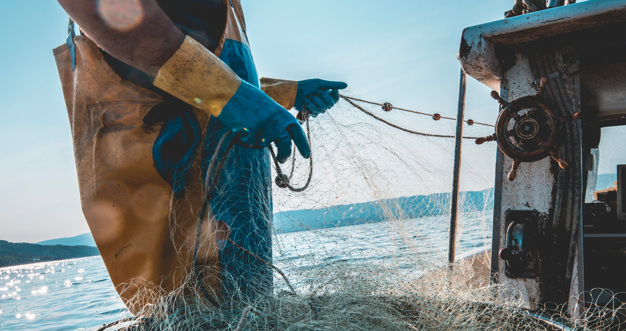
Photography plays a vital role in communicating the excellent work that The Fishmongers’ Company do. There is a wonderful photo library of their own imagery which help make the communications unique to them. Generally, we aim to capture real signs of humanity, avoiding contrived photography; it needs to feel spontaneous and real. The people photography captures real life, showing people at work, having a ‘fly on the wall’ feel or engaging directly with the camera. Imagery is always in full colour to give that authentic quality. Similarly, the location shots of the building exude the distinguished history and heritage of the Company, showing the grandeur of the Hall, giving a sense of space. We also hero detail where applicable, for example the food at an event, a beautiful ceiling or impressive chandelier.

Share:
“All the visual elements come together to create a distinct, ownable look for The Fishmongers’ Company; tradition meets modernity and creates some clarity and distinction between the different parts of the organisation”
Malcolm Gilbertson
MD & Creative Director, Silverback®
The Brand in Action
The new identity has been rolled out across all printed items including stationery, signage, event banners and invitations for the master brand and charitable trusts. We designed specific materials such as banners, invitations and a specialist Powerpoint presentation for their launch event. We have also helped the Company with their digital media including an animation to ‘top and tail’ their videos, social assets and a digital newsletter template. Last but by no means least, we have created a slick new website for them.
All of this is detailed in a comprehensive PDF brand guidelines document which explains to employees or anyone else that works on the brand, exactly how the assets should be used to ensure brand consistency both on and offline.

A New CMS Website
The website is a culmination of months of work both by the Silverback® digital team but arguably more so from The Fishmongers’ Company themselves who had to collate and write all the content. It would be fair to say that the old website was no longer fit for purpose and failed to showcase the excellent work that the organisation does. The new website is a clean, modern, responsive website that allows the Company to keep the content completely up to date through the CMS; it also clearly shows the different areas of the business and uses their beautiful photography to showcase the excellent work they do. See for yourself at www.fishmongers.org.uk
The website launched in November 2019 and we are all rather proud of our achievements.

Share:
“I am extremely proud of what the team has accomplished. Initially we set out to launch a new website but with Silverback’s guidance we quickly realised there was an opportunity to do far more. It was very important throughout the project not to ignore over 700 years of history; to maintain the heritage and tradition of the Company whilst making it relevant for today. The branding piece has exceeded our expectations and we are all excited about the the future for The Fishmongers’ Company and our charitable causes. Thank you Silverback!”