“Having the team at Silverback alongside us throughout [the rebrand] to remind us of what we wanted to say, push us on how we’re articulating it and show us smart ways to consider the site experience has been fantastic; real partners on the journey who 100% got us, and got it.” #Troopwork
Becky Lawrence
Marketing Manager
Discover
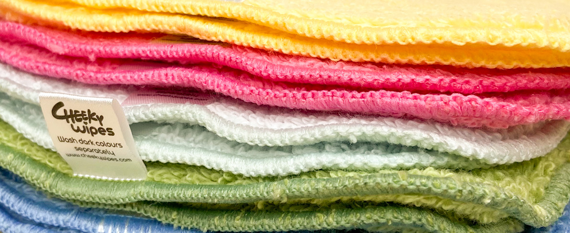
Industry pioneers, Cheeky® have been championing the reusable revolution since 2008. Not only have Cheeky® developed their reusable ‘One Wipe Wonder’ but they have turned their attention to creating a whole host of other planet-friendly reusable products! Their impressive product range has saved over 87 million disposable products from landfill so far. The company came to us through a recommendation where they were gifted a Silverback® Brand Encounter by an existing client and we were excited to find out more about them.
Design
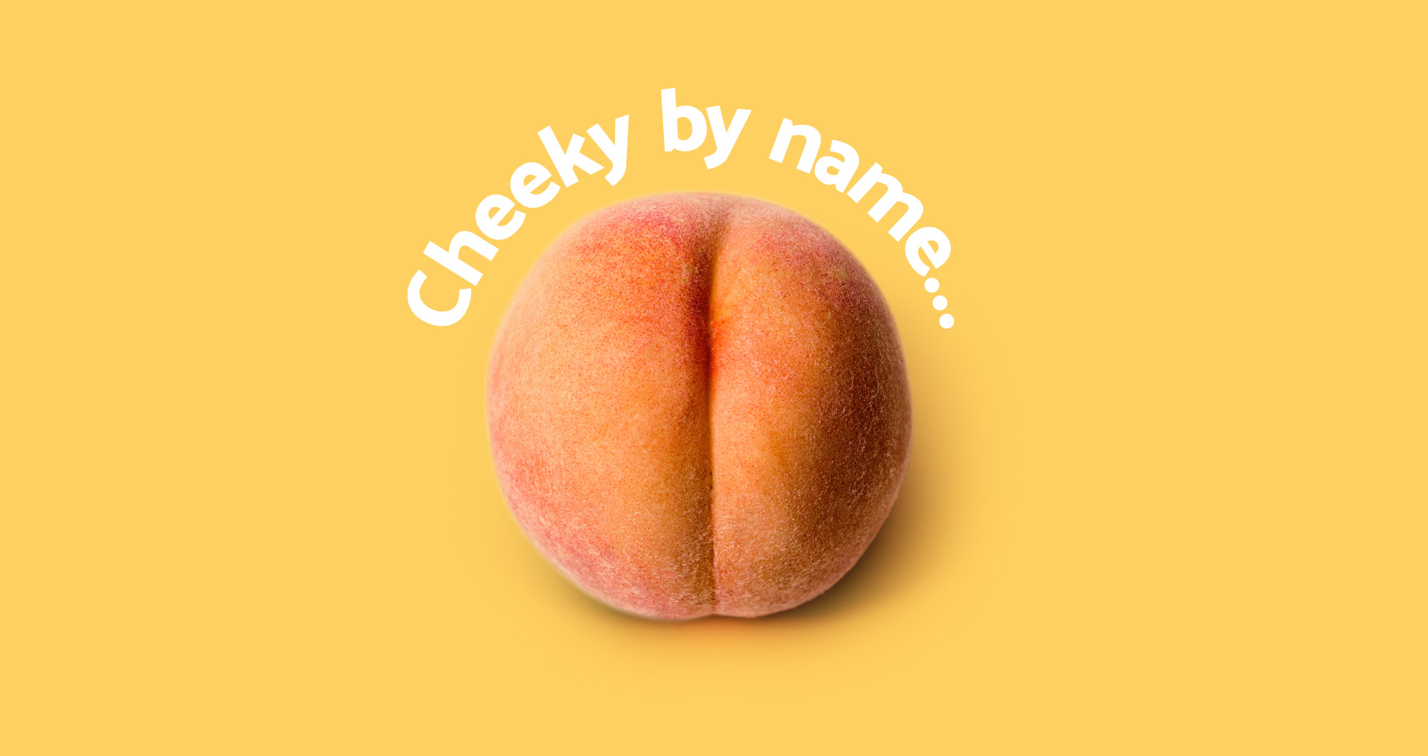
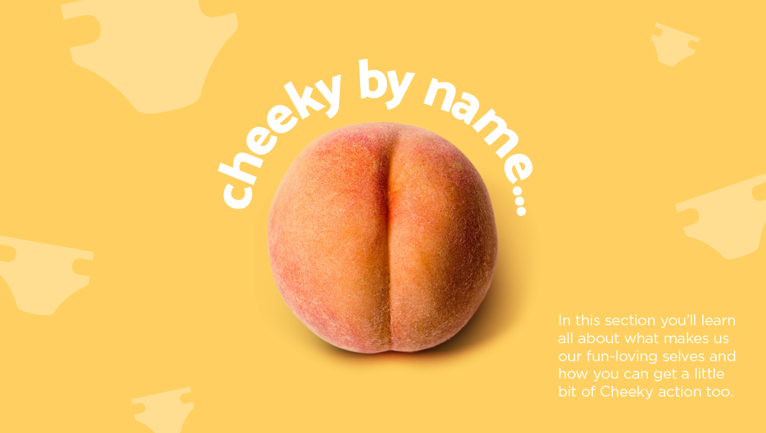
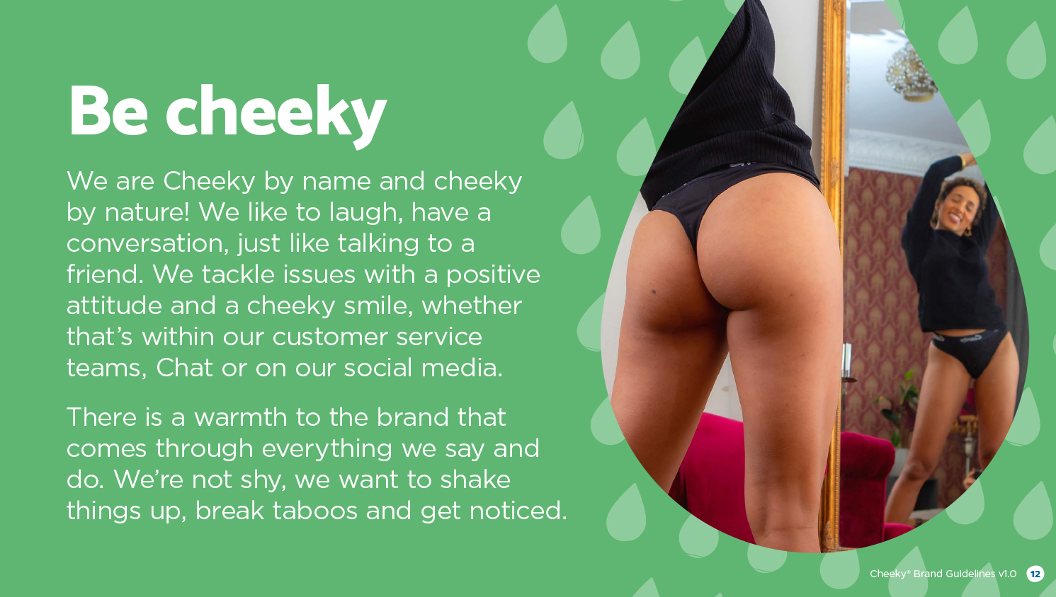
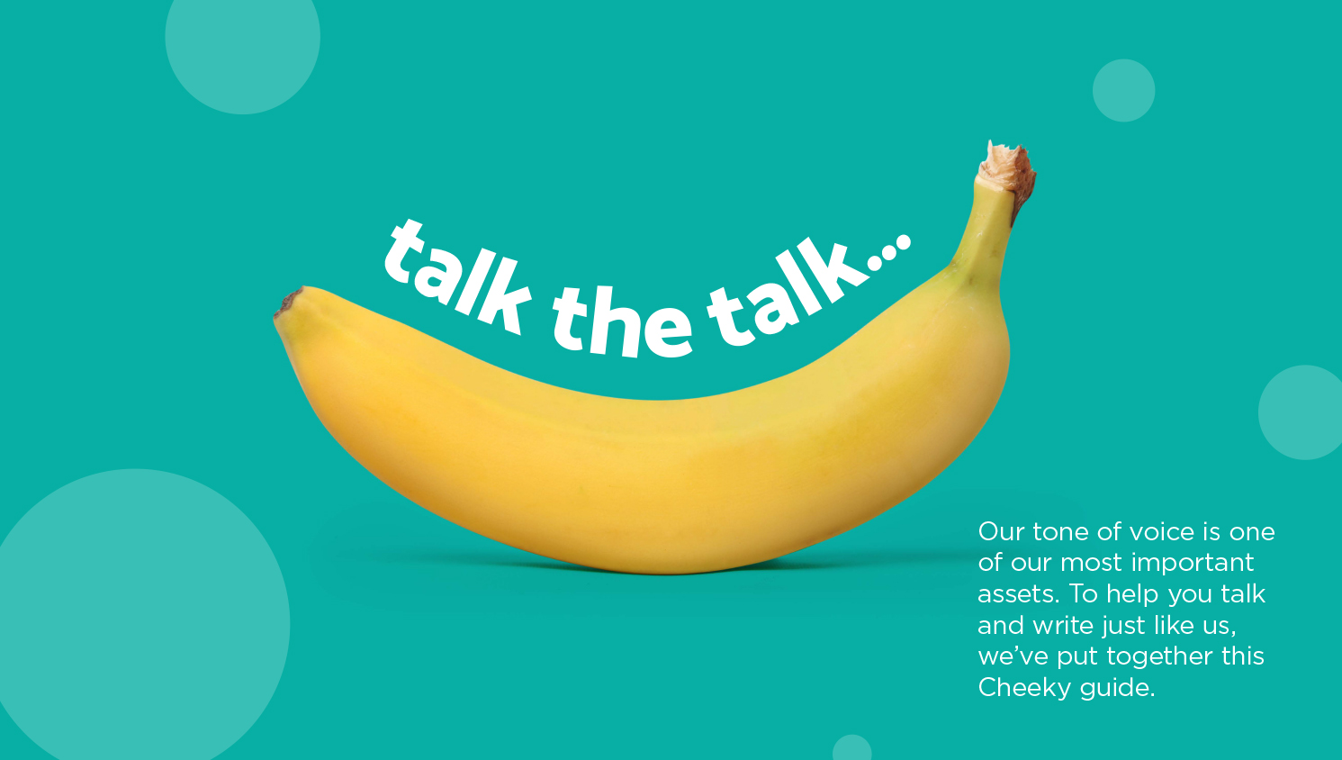
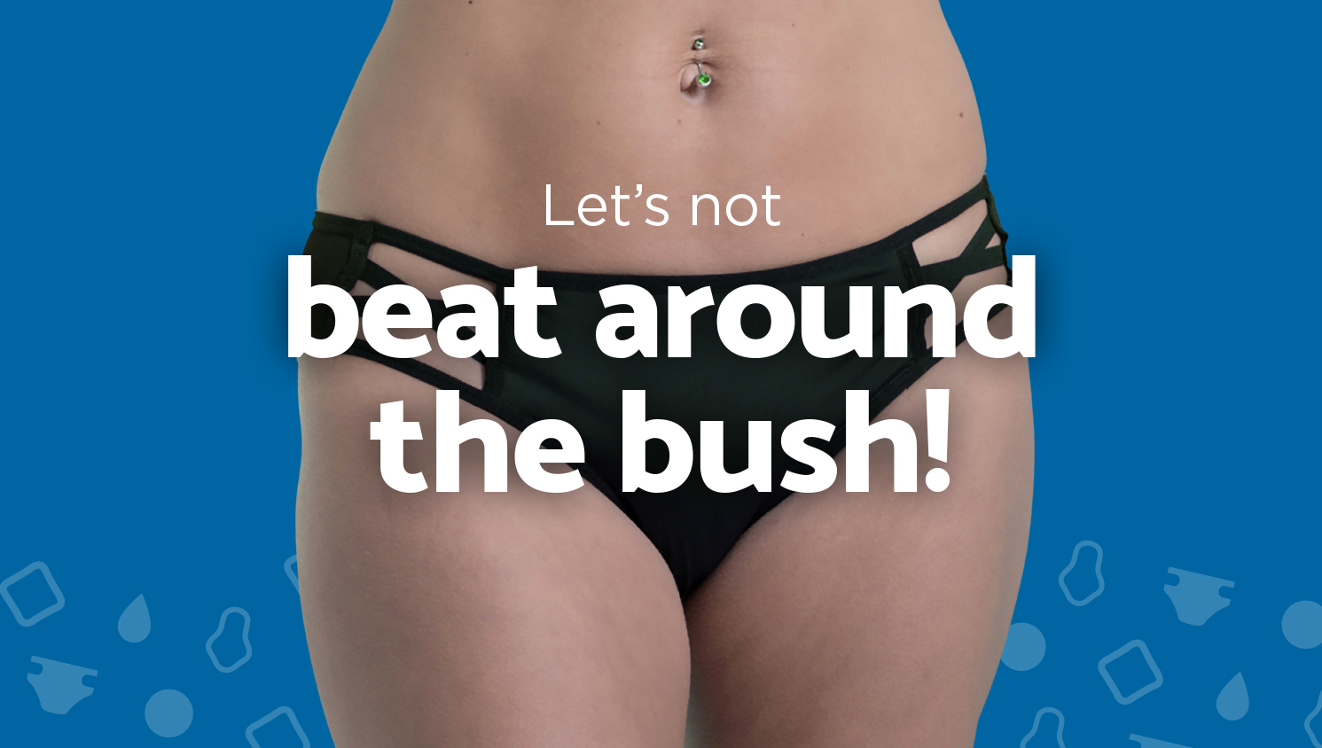
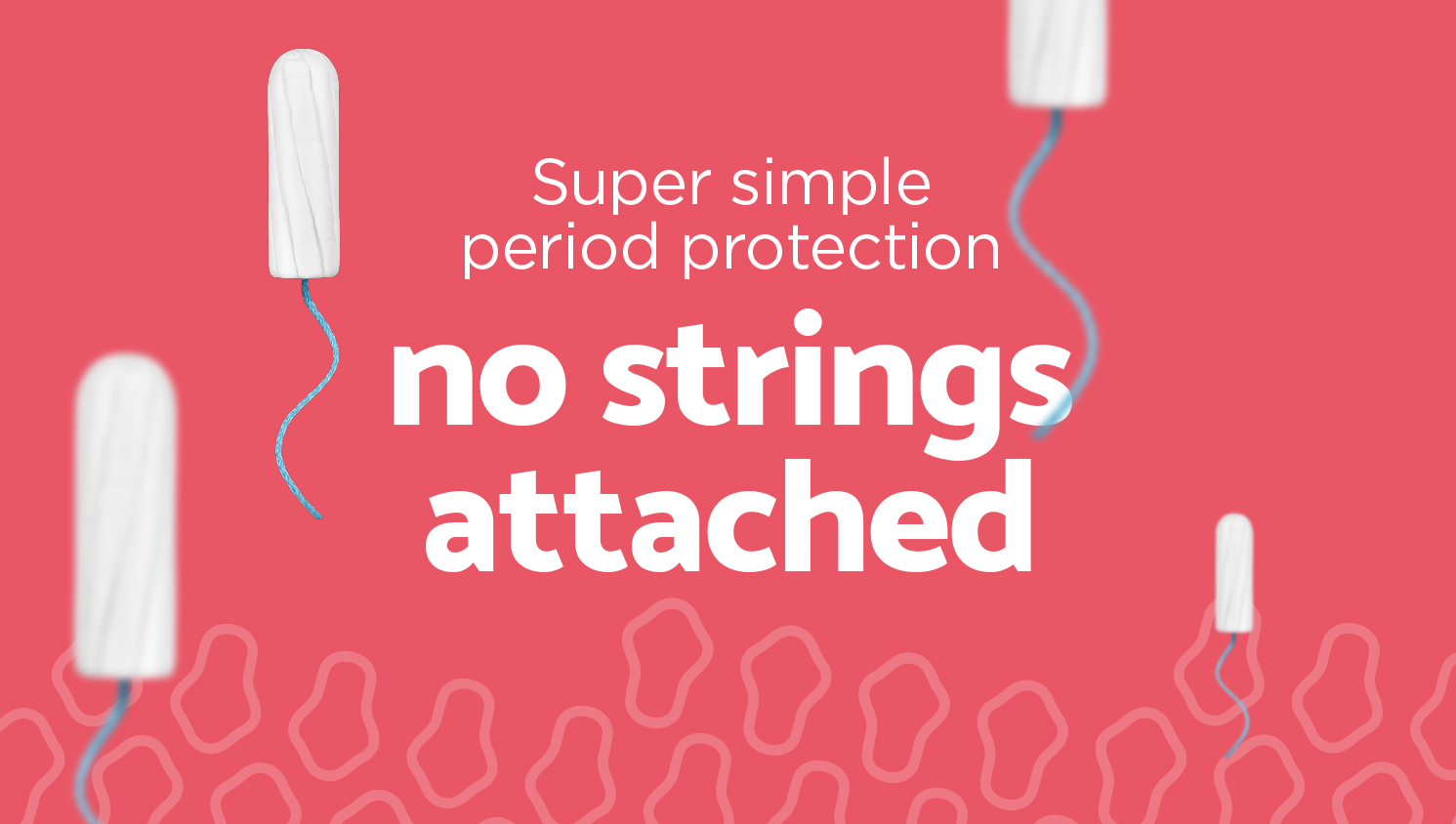
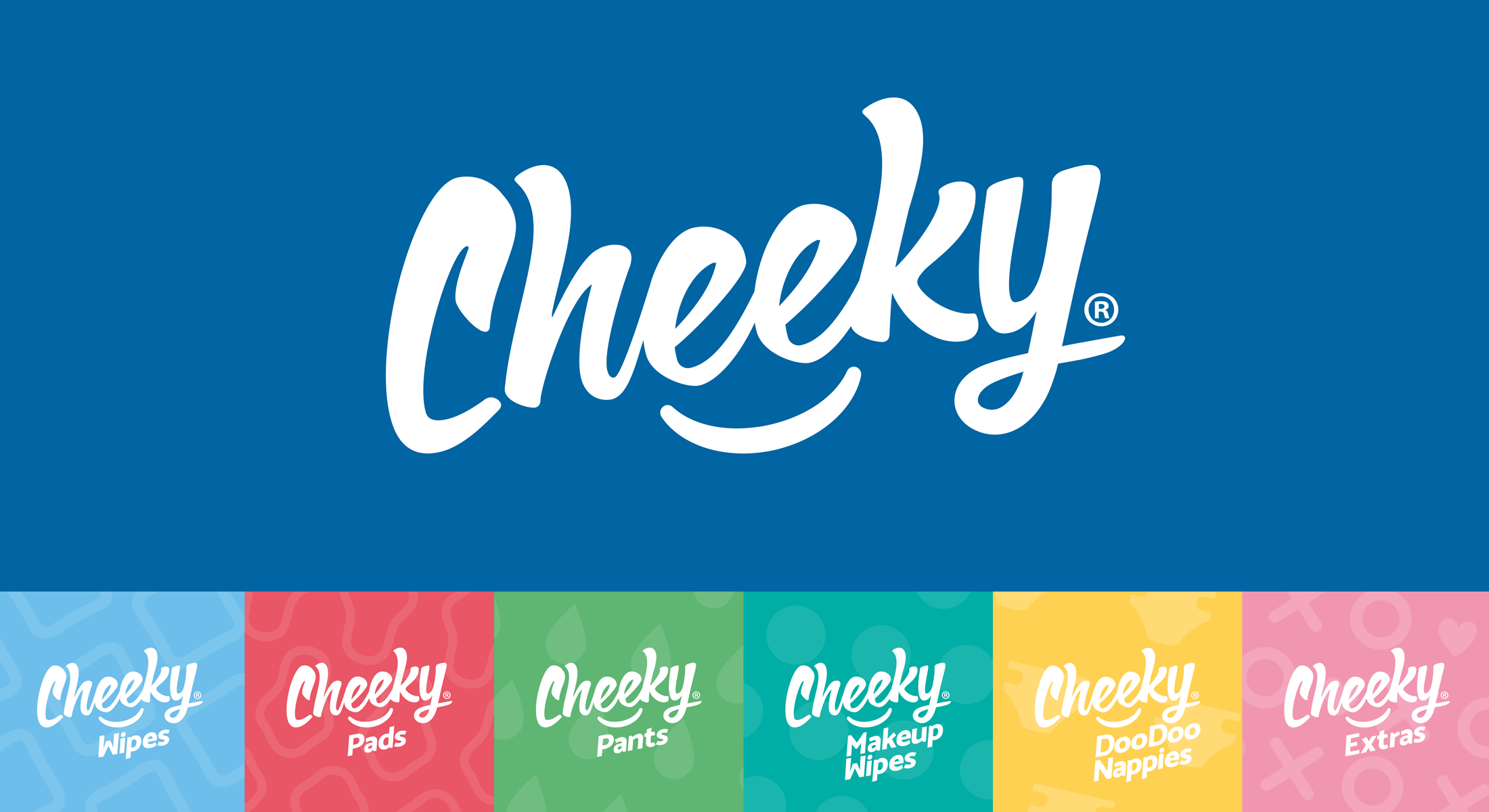
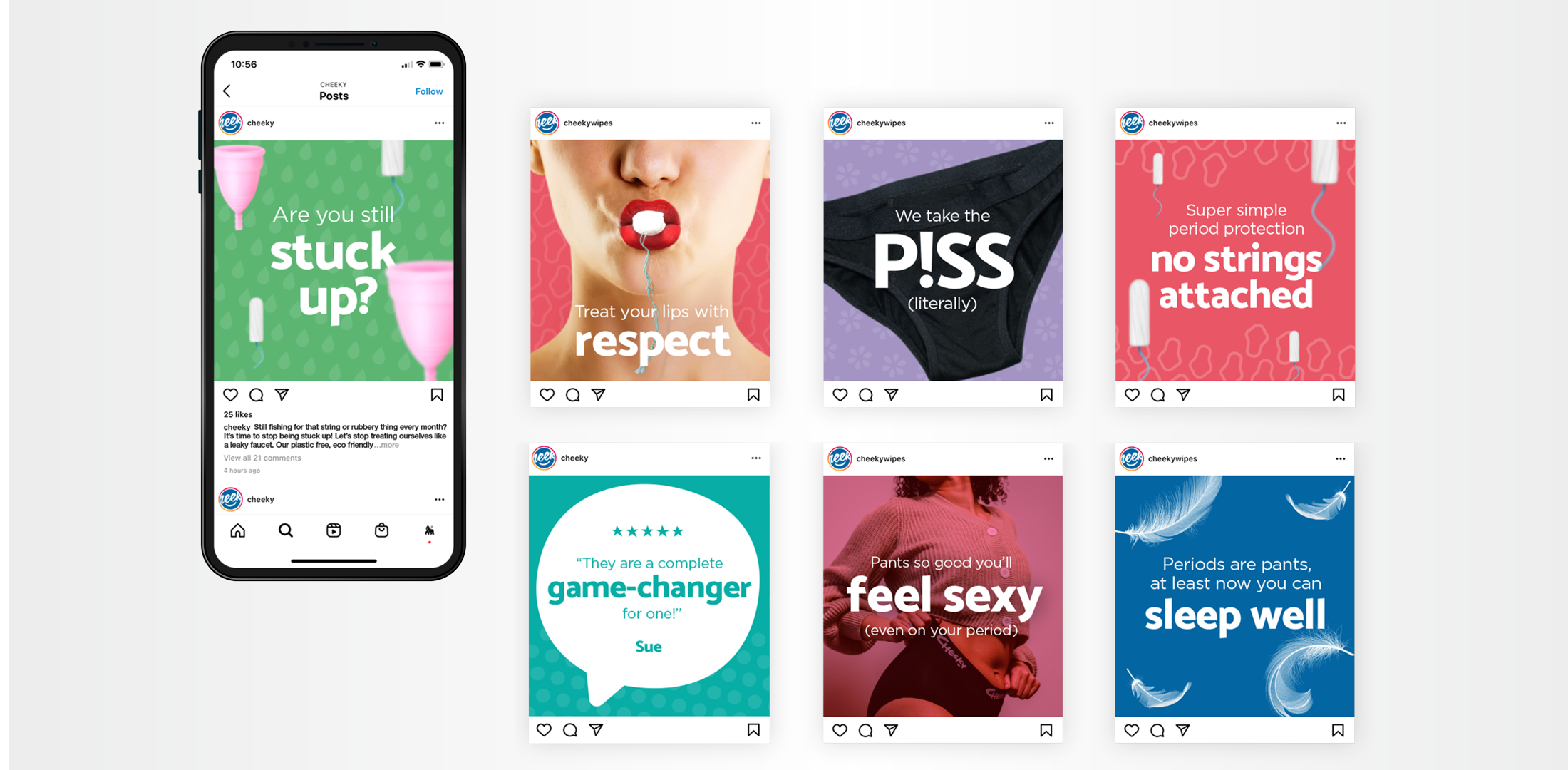
The Brand Encounter saw core members of the Cheeky® team join forces with the Troop in an extensive discovery session at Silverback HQ. We quickly came to understand the brand, its values and personality to get a real idea of where they want to go as a company. We soon discovered that with a widening range of products and target markets, the brand needed new brand architecture. We began by working out how best to break up the categories in terms of searchability, functionality and needs of their customers. We started to look at naming options and how the master and sub-brands might work both together and in their own right. The branding needed to communicate who they are whilst portraying values consistently across internal and external touchpoints. We had a lot of fun with the tongue-in-cheek tone of voice for Cheeky®, creating engaging content for web banners, adwords campaigns and social media posts to bust taboos and get people talking.
Develop
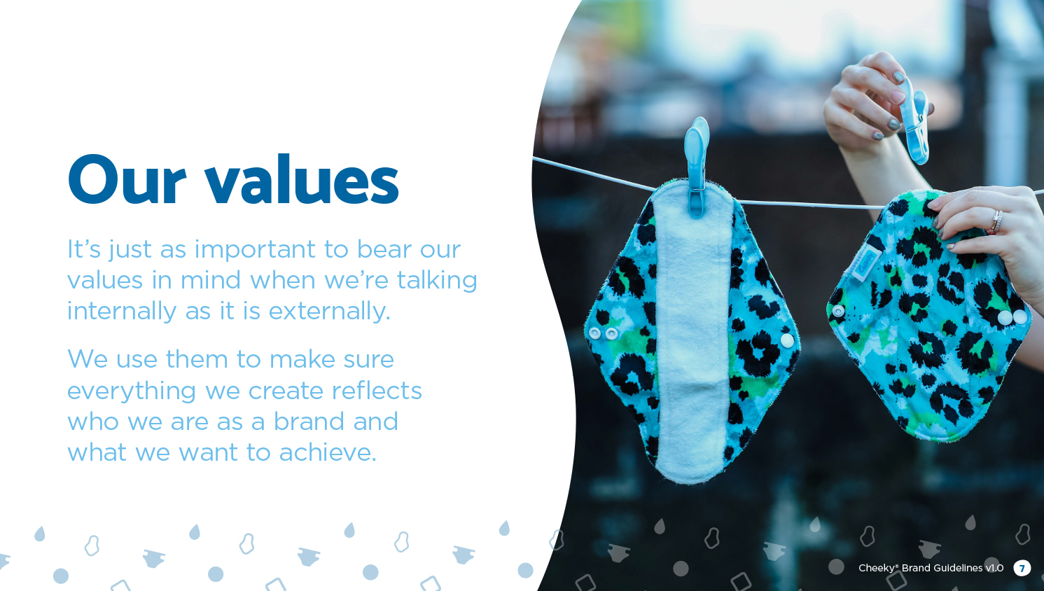
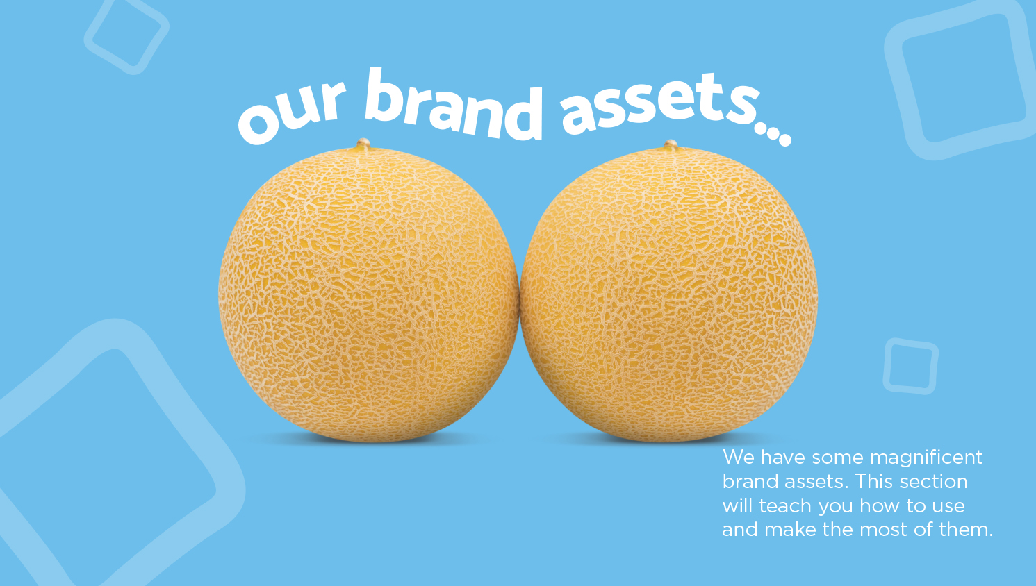
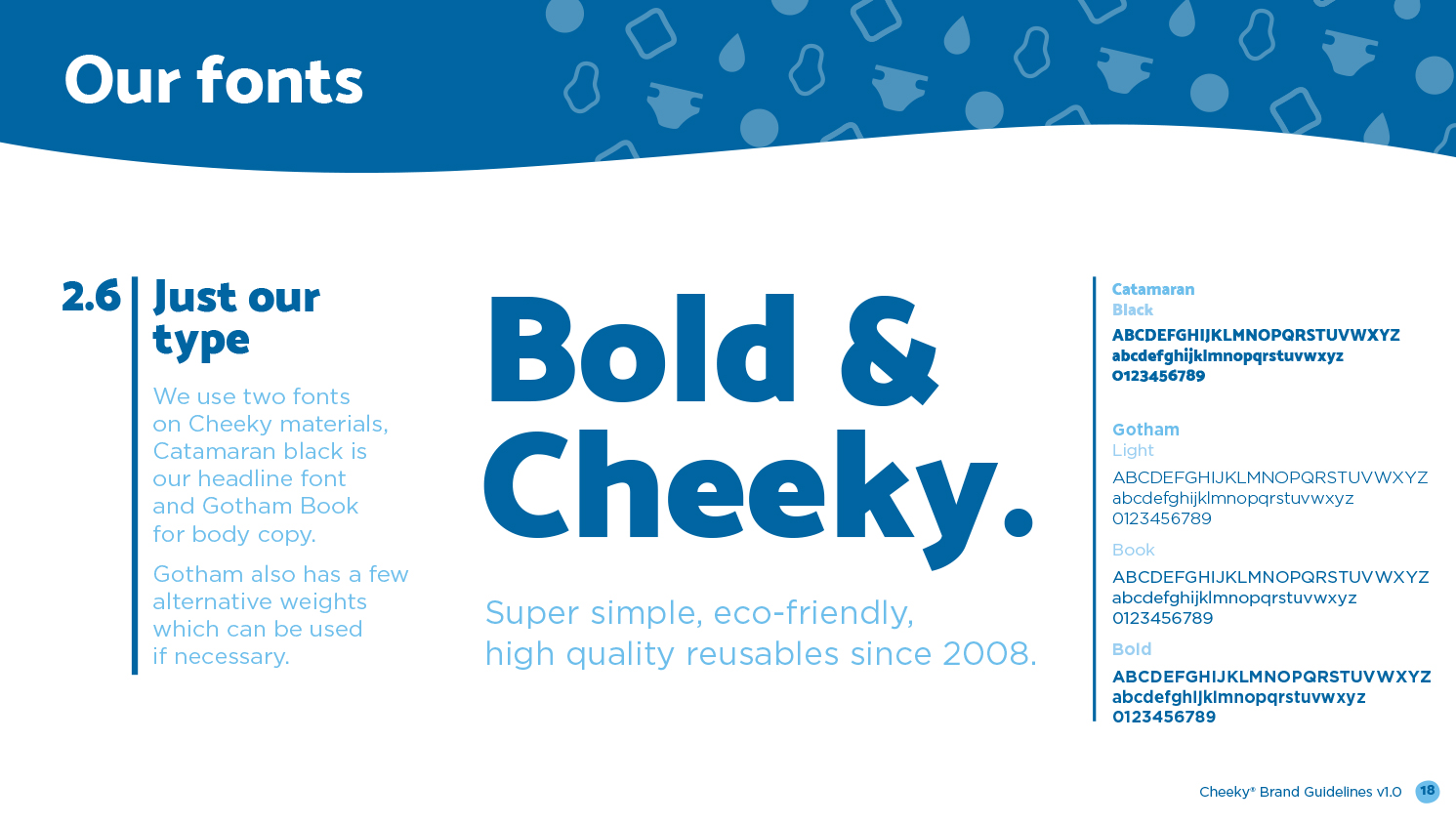
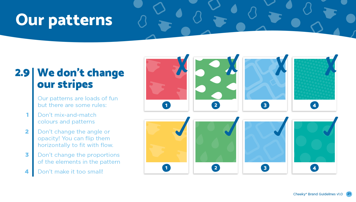
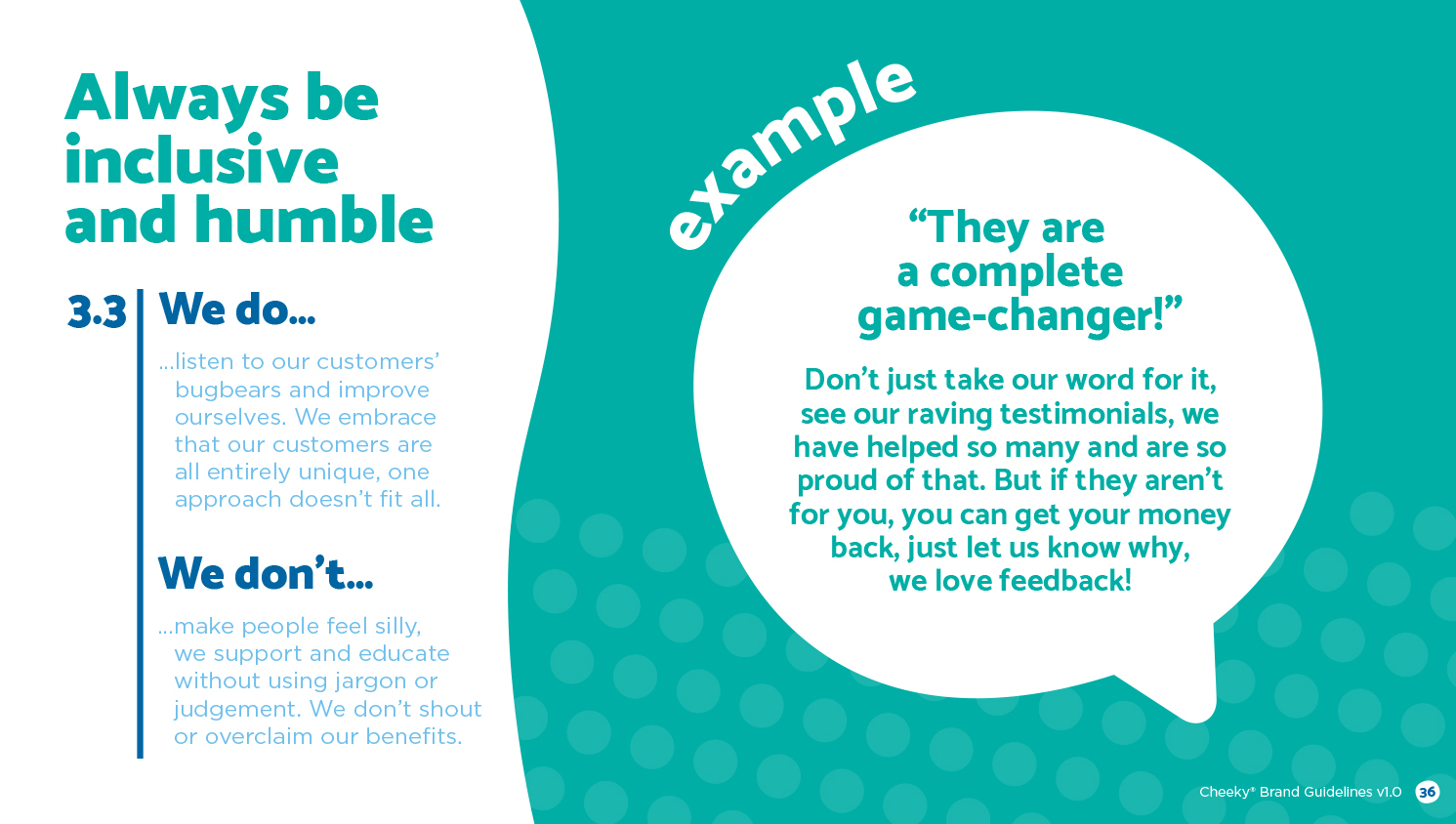
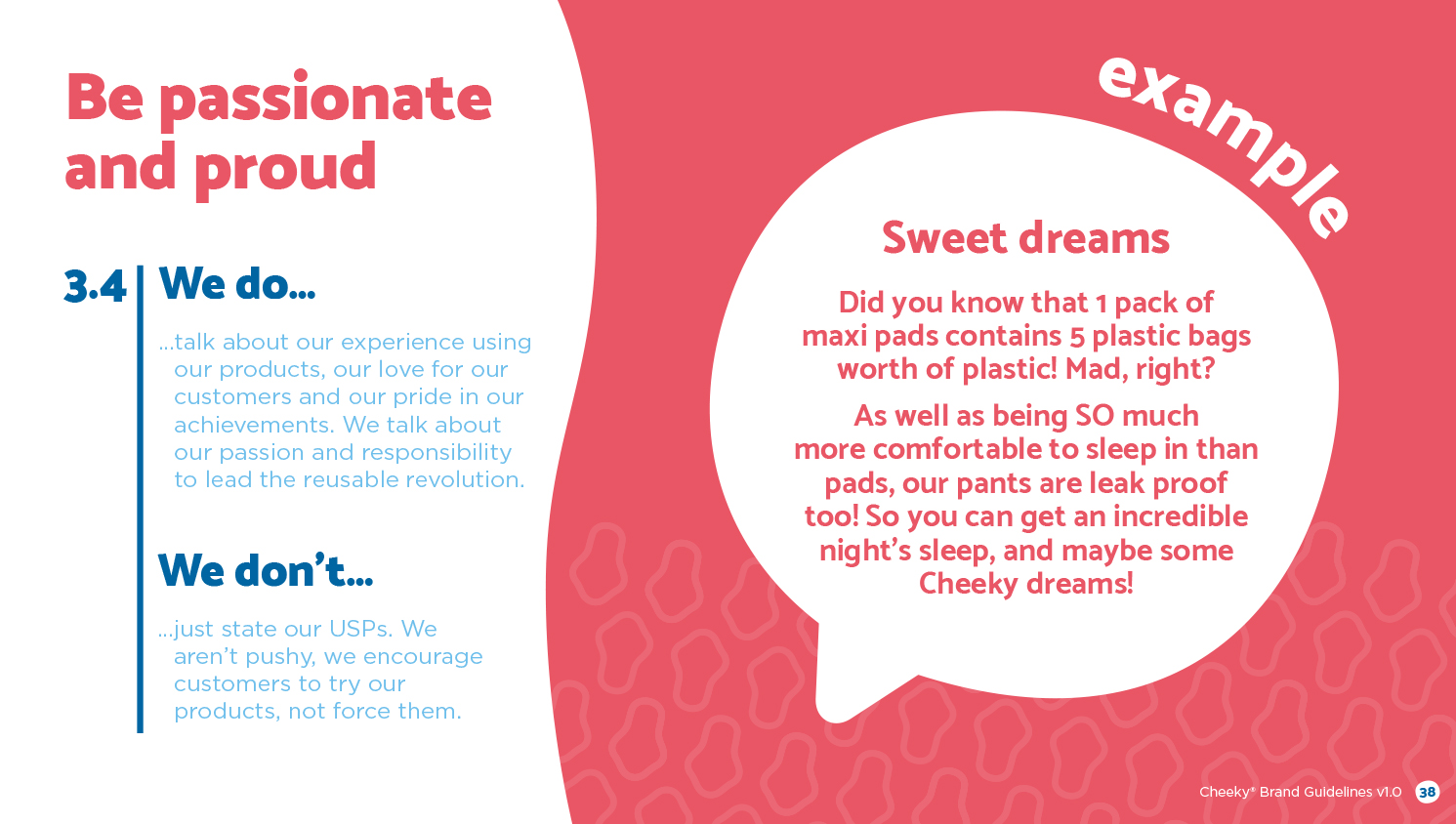
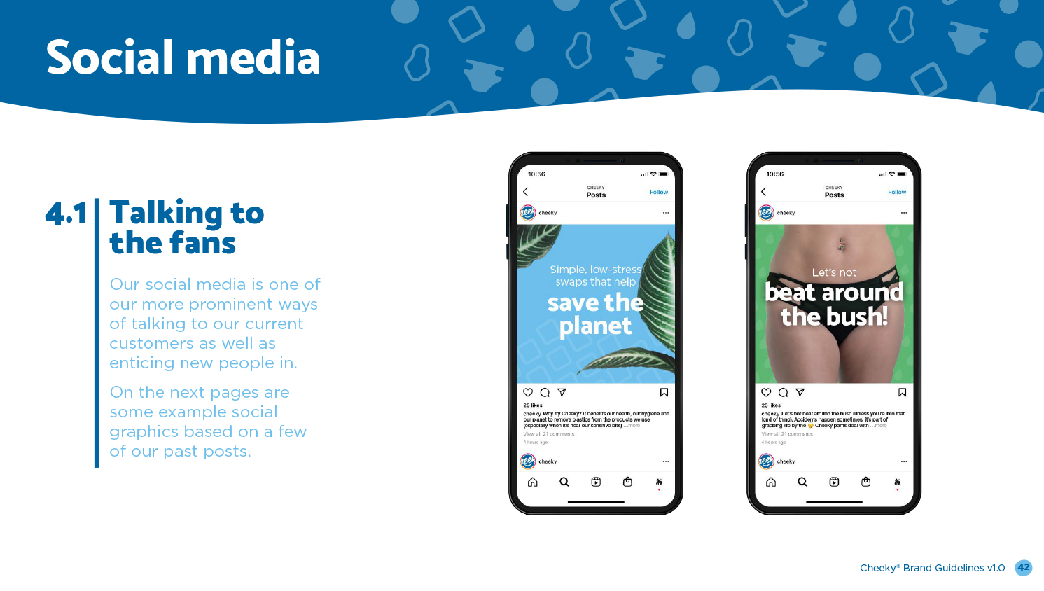
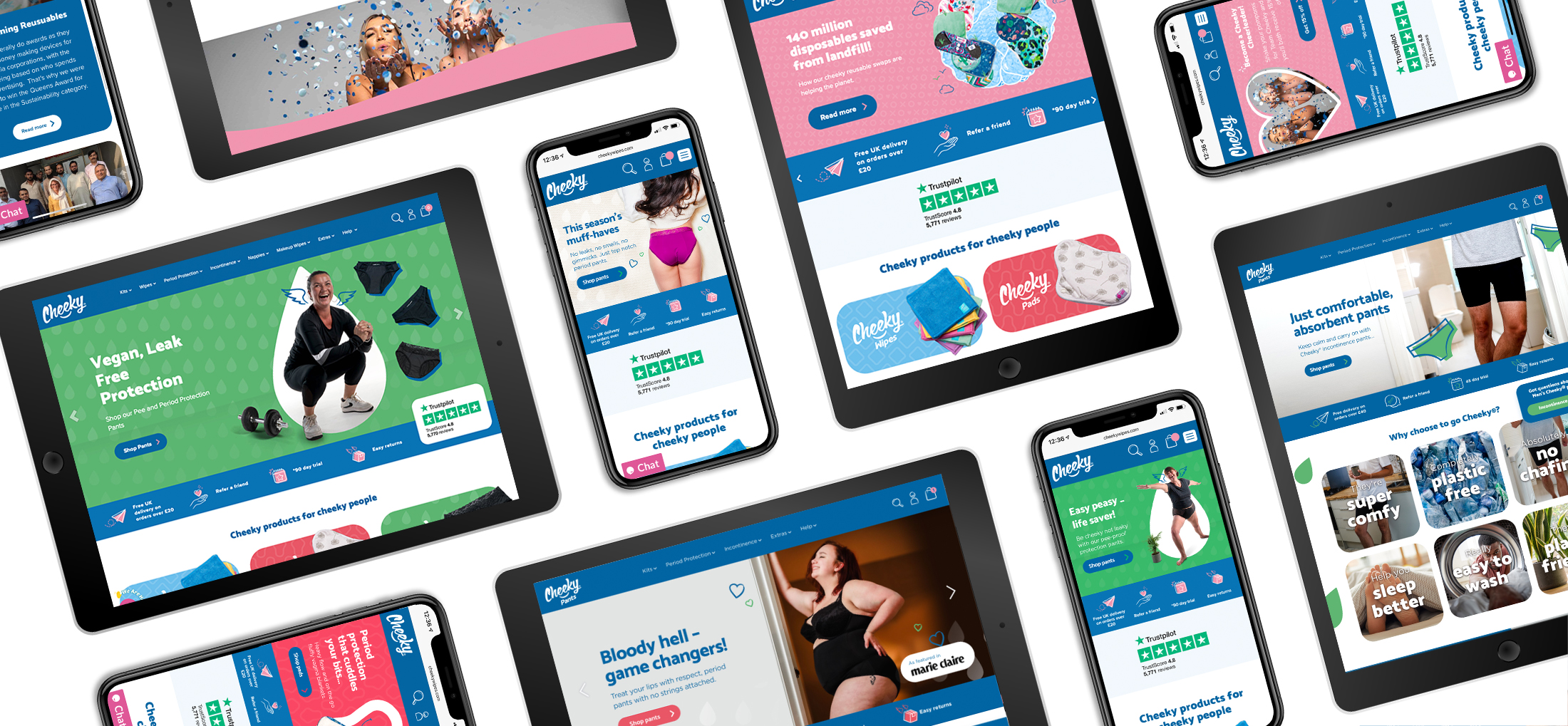
A large part of the rollout was the design of the new website; we created a navigation structure, wrote content, created a suite of bespoke illustrations and infographics and implemented the design using their existing CMS. We needed to make sure that each product line had the right feel and tone for the target audience. During this process it became apparent that Cheeky Pants, in particular, have their own landing site, giving more opportunities for tailored content and marketing, as well as improved UX for the consumer. The result was a new, recognisable colour palette, pattern suite and an engaging illustration style – keeping the visual identity fun, friendly and cheeky. To help the company stay consistent and on brand after the rollout, we created brand guidelines for the team to use. The guidelines included the brand’s vision, mission and values as well as a guide to the do’s and don’ts of the visual identity – all written in the cheeky tone of voice of course!
Deliver
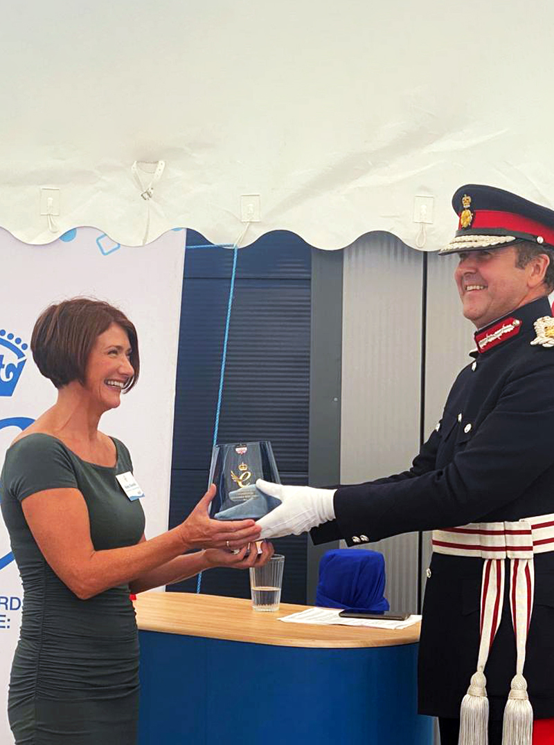
We love the new look and are pleased to have helped update the company’s identity, allowing them to push the sub-brands to reach new audiences. We were pleased to hear that the company have increased sales through the new site, have a much lower bounce rate, have sold more than ever through their sub-brands, targeted new markets and even won The Queen’s Award for sustainability. This project showcased how well we excel at producing exceptional deliverables that bring results. What a year! We look forward to seeing what is next for this Cheeky bunch!
If you’re looking for help revitalising your brand identity, get in touch and see how we could help! 👇👇
Let’s have a chat…
"*" indicates required fields
